The Best Color Palettes for Vintage Rustic Interiors
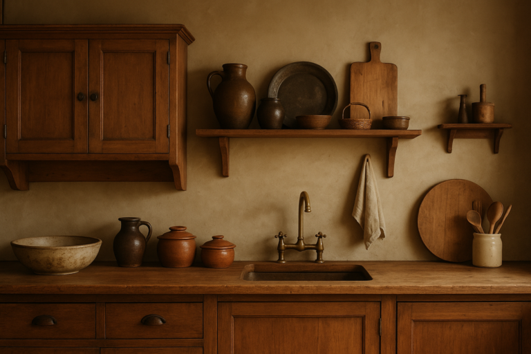
Vintage rustic interiors rely on textures you can feel and colors that feel aged yet welcoming. The best color palettes for this style blend warm neutrals, earthy tones, and softly desaturated hues that mimic patina and sun-worn surfaces. Below are five palettes you can use as anchors, plus practical tips for applying them in living rooms, kitchens, bedrooms, and beyond.
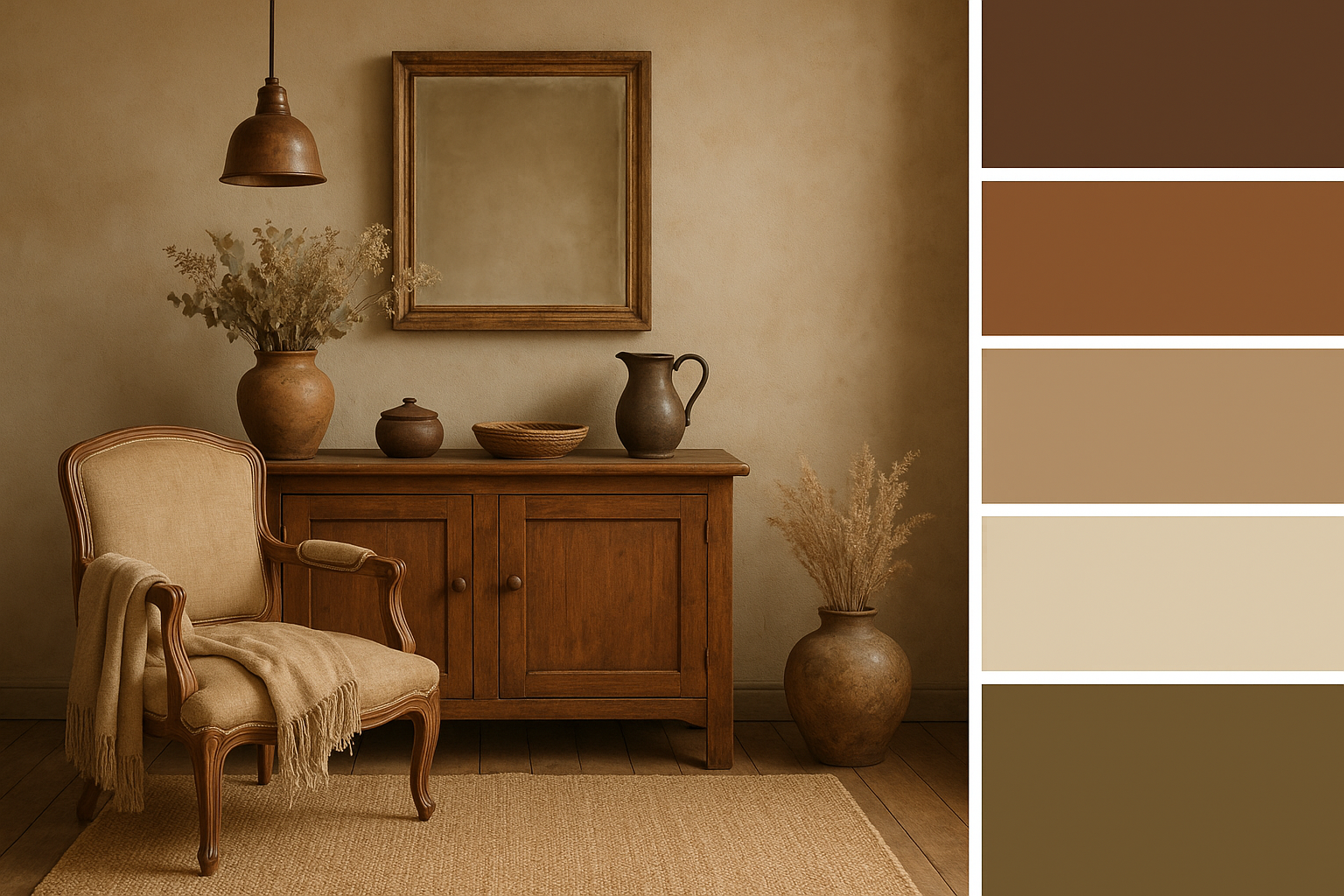
Neutral Foundations
If you want a timeless, versatile base, start with neutral foundations that resemble weathered plaster, linen, and driftwood. These colors create a calm backdrop for rustic wood, vintage fabrics, and antique metals.
Swatches (start points)
– Linen White: #F5F1EB
– Oatmeal: #DDD4C4
– Weathered Wood: #A89F93
– Clay Taupe: #C2B2A0
– Charcoal Accent: #2E2E2E
How to use
– Walls: Use Linen White or Oatmeal for a soft, airy backdrop. Leave a single accent wall in Weathered Wood or Clay Taupe for warmth.
– Upholstery: Choose natural fibers in oatmeal or linen blends; add a charcoal sofa or chairs for contrast.
– Finishes: Matte paint, waxed wood, and brushed brass or aged copper accents echo vintage warmth.
– Textiles: Layer burlap, linen, and wool in neutral tones; introduce subtle texture with a quilted throw or a crocheted blanket.
Why it works
Neutral foundations echo sun-bleached plaster and aged timber, letting patina and texture take center stage. They’re forgiving in small spaces and pair well with antique wood finishes and metal accents.
Earthy Greens and Sage
Earthy greens bring the outdoors inside, reinforcing a rustic, hillside-chalet mood without feeling “kamping.” Use these tones to connect indoor spaces with natural landscapes.
Swatches
– Sage Green: #93A487
– Olive: #7A8A60
– Moss: #5A6B3F
– Sand: #D8C7B7
– Deep Charcoal (for contrast): #2A2A2A
How to use
– Walls and ceilings: A soft sage on an accent wall, with the rest in warm neutrals.
– Woodwork and cabinetry: Olive or moss accents over weathered wood for a vintage-linish kitchen or pantry.
– Textiles: Moss or sage curtains with oatmeal upholstery; add a woven jute rug to anchor the space.
– Accents: Clay or terracotta ceramics, plant materials, and matte brass hardware.
Why it works
Green tones echo moss, leaves, and herb-dried textures, enhancing the sense of a space that feels lived-in and connected to the outdoors—perfect for vintage rustic interiors.
Dusty Blues and Whites
Muted blues with soft whites create a coastal-rustic vibe that still feels rustic and timeless. This palette is especially good for kitchens, bedrooms, and bathrooms where you want a calm, nostalgic air.
Swatches
– Powder Blue: #AFC4D8
– Old Linen White: #F1F1F0
– Slate Gray: #738190
– Navy Accent: #2D3A54
– Ivory: #F6F2E6
How to use
– Walls: Pair Old Linen White with an accent wall in Powder Blue or Navy for depth.
– Cabinets and furniture: Use navy sparingly on a single piece (like a cabinet or bed frame) to avoid overpowering the room.
– Textiles: Add ivory or ivory-blend fabrics, along with a vintage rug in muted blues and creams.
– Accessories: Ceramic dishes, glass lanterns, and distressed metal hardware in brass or antique nickel.
Why it works
Dusty blues feel relaxed and weathered, like a seaside cottage that has aged gracefully. The soft whites keep things light, while the blues add a quiet, antique charm.
Brick Reds and Terracotta
Brick and terracotta tones bring warmth and vintage character—think clay pots, sunbaked walls, and classic country kitchens. Use them as accents or in larger blocks if you love a bold rustic look.
Swatches
– Brick Red: #B7442A
– Terracotta: #D07650
– Sandstone: #E3CDB0
– Charred Black: #3E2A22
– Cream: #F5E6D9
How to use
– Walls and floors: Touch a room with Terracotta or Brick Red on a single wall or in a tile arrangement; balance with Sandstone or Cream elsewhere.
– Kitchen and dining: Terra-cotta ceramic tiles or a tiled backsplash paired with warm wood cabinets.
– Textiles: Plaids, checks, or floral patterns in brick and cream tones for window treatments, cushions, or table linens.
– Accessories: Woven baskets, rustic pottery, and aged-metal fixtures in matte brass or bronze.
Why it works
Red and terracotta hues read as grounded, traditional, and comforting. They pair naturally with dark wood tones and aged metals, enhancing the vintage rustic feel.
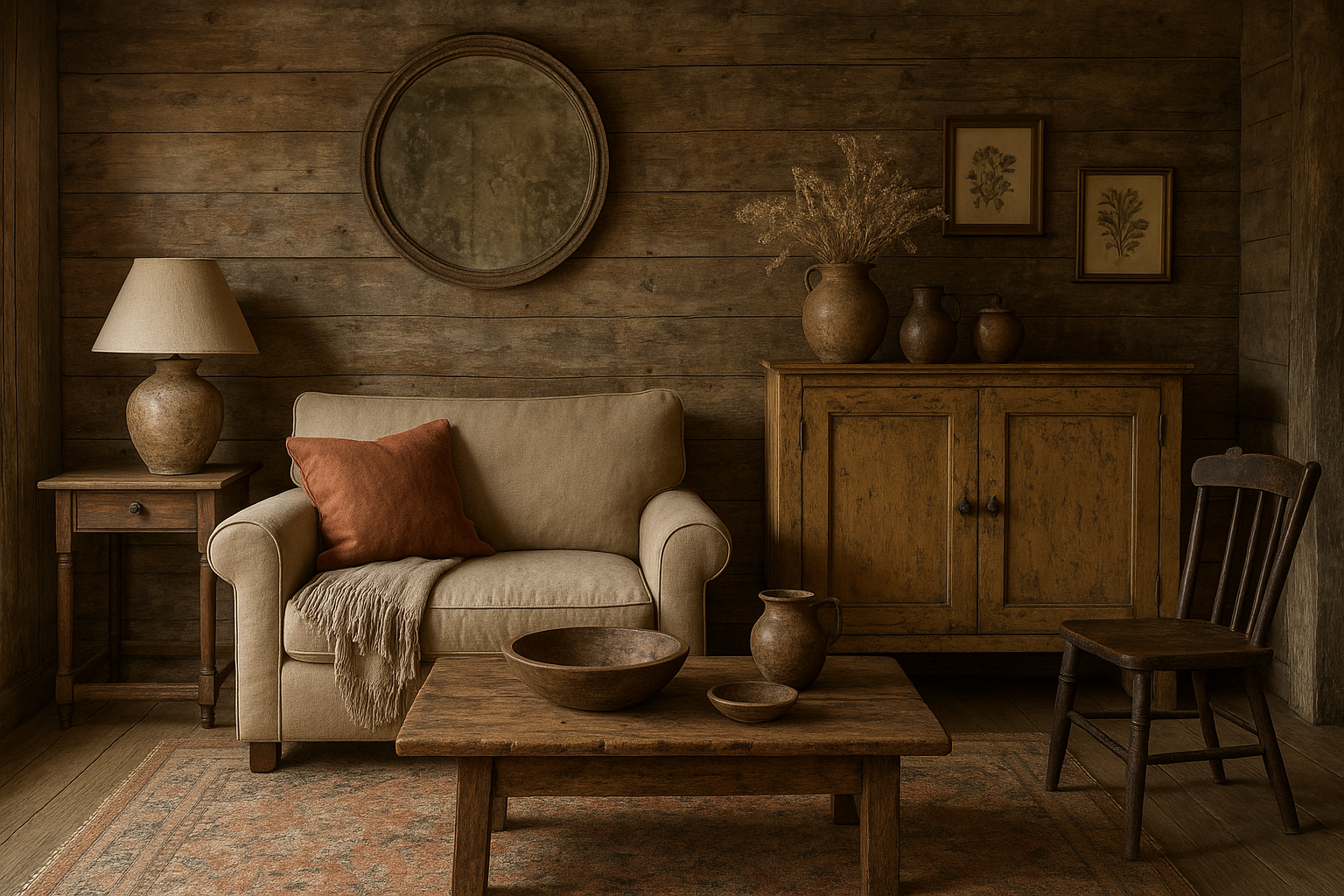
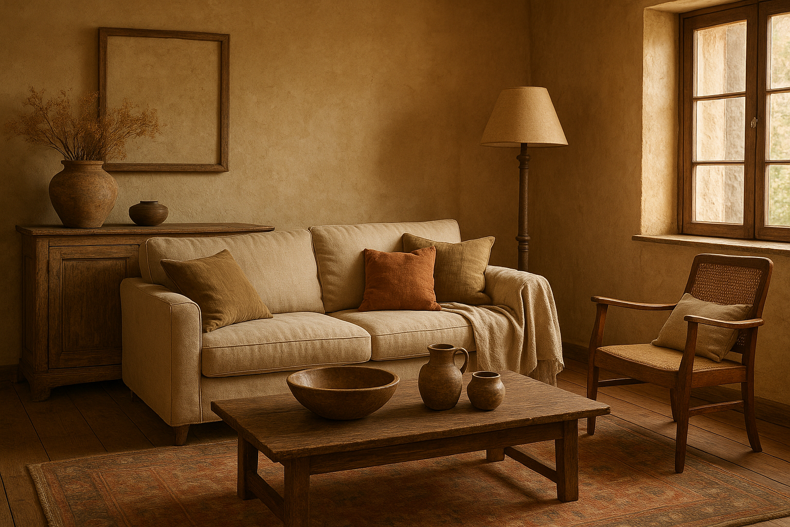
Charcoal and Warm Wood
This palette focuses on the drama of charcoal neutrals contrasted with the warmth of timber and honeyed metals. It’s excellent for larger living rooms, dining spaces, and lofts that want a bold yet rustic vibe.
Swatches
– Charcoal: #333333
– Warm Wood (Oak/Walnut look): #8D6E41
– Cream: #F1E6D7
– Brass Accent: #B8922D
– Pale Gray: #C4C4C4
How to use
– Walls: Charcoal walls can work in larger rooms, with cream ceilings or lighter trim to avoid a closed-in feel.
– Floors: Expose natural wood or use a warm wood finish; a charcoal rug can anchor seating areas.
– Metal and hardware: Choose aged brass or bronze for lighting, cabinet handles, and mirrors.
– Textiles: Mix charcoal upholstery with soft cream or warm wood accents; add a throw in a lighter gray or beige.
Why it works
Charcoal adds depth and a modern edge to rustic warmth. Pairing it with warm woods and antique metals preserves the vintage feel while keeping the space contemporary and sophisticated.
How to mix and apply these palettes
– Start with a dominant palette: Choose one of the five palettes as the primary color story for walls, large textiles, and major furniture.
– Add a supporting palette: Introduce a complementary palette in smaller doses for accents, fabrics, and accessories.
– Use swatches in daylight: Check colors at different times of day to see how they shift with natural and artificial light.
– Ground with texture: Layer textures—lived-in leather, linen, wool, jute, and weathered wood—to reinforce the rustic vibe without relying on bold color alone.
– Consider finishes: Matte paints, waxed woods, and patinated metals create the sense of age and character that defines vintage rustic interiors.
Room-specific tips
– Living room: A neutral base with an accent chair or ottoman in one of the warmer hues (terracotta or brick red) creates focal depth. Soften with a textured rug and a mix of linen and wool textiles.
– Kitchen: Use terracotta or sage on cabinets or a tile backsplash, paired with natural wood countertops and aged brass hardware.
– Bedroom: Choose soft neutrals for walls (linen white or warm oatmeal), add a sage or slate-blue duvet, and finish with a washed wood bed frame and vintage lamps.
– Bathroom: Pale blues and creams with matte black or brass fixtures can evoke a seaside cottage vibe while keeping the rustic feel.
Final note
The best color palettes for vintage rustic interiors aren’t about rigid rules but about creating warmth, patina, and a sense of history. Start with a foundational neutral, layer in earthy or muted hues, and then punctuate with small doses of richer tones or metallics. With the right balance of color, texture, and age-inspired finishes, you can craft a space that truly feels timeless and welcoming. If you’d like, tell me the room size, lighting, and preferred wood species, and I’ll tailor a palette with precise swatches and usage guidelines.